How to have a STAND-OUT "about me" page

The “about me” page is a big deal.
WANT TO LEARN MORE ABOUT SHOOTING IN A STUDIO? Or talk about your business and website in person?! I OFFER ONE-ON-ONE MENTOR SESSIONS FOR PHOTOGRAPHER’S OF ALL LEVELS! IF YOU’RE READY TO INVEST IN YOURSELF, LET’S GET IN TOUCH!
Running a photography business is a bit tricky, because you are selling a product (your photos) but you are also selling your service—basically selling yourself. Especially If you are doing weddings, and with social media being so prevalent, people are hiring you because they like your work AND because they like you.
So. How do you create the perfect page about you?
1) Remember that “you” are actually a business.
Which means your “about me” page should really be “about this business”. Instead of describing your favorite foods or netflix shows, describe your work, your qualifying experiences, your special skills, and what clients will get when they choose to hire you. Instead of telling people what you love in your personal life, tell them what they will love about what you have to offer them.
PRO TIP: Write your “about me” page like a highlights real from your resume. Include what services you offer, outline your strengths and talk about things that make you a good candidate for hire!
2) Keep it brief
I would recommend 200 words or less. You want them to get a good overview without getting bored. Just enough to tell them who you are as a business, that little excerpt is meant to be a sidecar to your portfolio, which is likely the deal starter and closer for your clients. The “about you” info is just a little bit of dimension to help tip the scales, or simply educate them on who you are and your credentials so they feel even more comfortable and confident hiring you after they fall in love with your portfolio.
3) The Photo
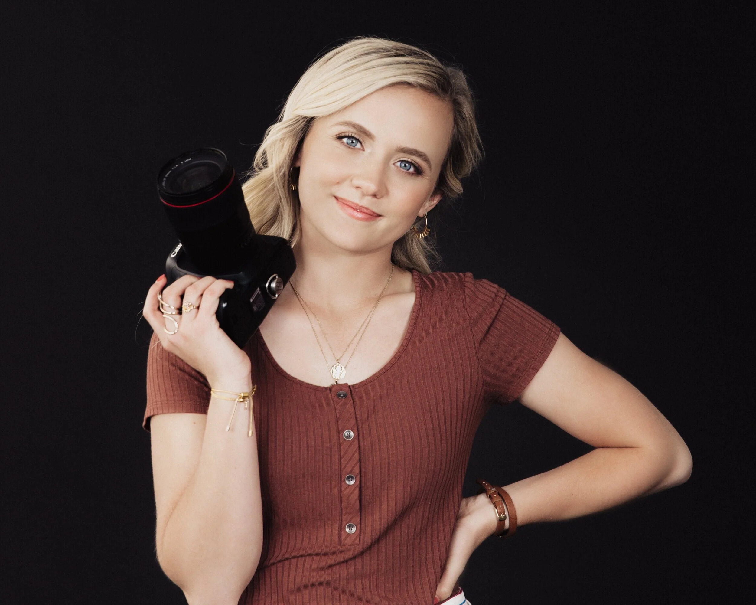
This is a major focal point of the “about me” page. While most of us photographer’s are savvy as can be behind the lens, it’s often hard for us to get in front of the camera and get good photos of ourselves.
For a strong photo, avoid photos like these:
Photos with you looking down or away from the camera. You want to come across confident, not shy. You want to look your potential clients straight in the eye. So choose a more straightforward headshot.
Photos that don’t show your face, or have other people in them. Avoid choosing a photo with your back to the camera—even if it’s showing you in action on a photoshoot. Or if you travel a lot, and you have a photo of you and your love in front of the Eiffel Tower, save that for instagram and choose a photo that clearly shows who you are.
PRO TIP **It’s awesome to show clients you love to travel to shoot, but let that show in photos of clients you’ve shot abroad in your portfolio instead of on your “about me” page. and if a personal photo with you and your love is a must for you, consider moving it to the bottom of the page, and position a more straightforward headshot at the top.
Photos that don’t go along with your aesthetic. Of course you will want to hire someone to take your professional business portraits, and their style isn’t going to be exactly the same as yours, SO. be careful who you pick. If you edit extremely true to color and clean, avoid having a photo of yourself that is edited warm, dark, and moody!
LOOKING FOR A PORTRAIT PHOTOGRAPHER? LET’S GET IN TOUCH! I LOVE SHOOTING HEADSHOTS FOR OTHER CREATIVES AND BUSINESS OWNERS!
4) Speak to your ideal client
Something I see A LOT on “about me” pages are phrases like “I want to be friends with you” Think of it this way. You want to be treated like a professional, you want people to respect you and your policies. It’s a lot harder to communicate boundaries and policies to your “friend”. and yes. of course we love our clients, and we want to be friendly and we want them to be friendly back, but we also need to be professional so they respect us and trust us. It also feels more difficult to charge full price to your “friends”. Using those casual phrases will likely attract lower budget clients, or clients seeking a bargain. If your platform is that you are budget friendly then that will work great, but if it’s not, you may want to cut the casual talk from your business description.
5) keep it clean
Make your “about me” page very simple. If you have other elements like client reviews or other things displayed, make sure they are subtle and clearly labeled. Something I’ve seen a few times is an about me page with client reviews that include photos of the clients next to the review. It made me unsure of which photo was of the photographer because they were the focal point of the page.
6) Call to action
End your “about me” excerpt with a call to action. You can have something that leads them to your contact page, or something that leads them to your portfolio, or something that leads them to your client reviews, or links to all 3! The goal of your website is to get bookings, so make sure there is a clear “next step” for potential clients once they get themselves as far as your “about” page.
